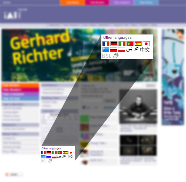
The Tate Galleries in the UK are a word-class collection of galleries and have a great website — with the exception of the language links on the homepage.
The most interesting part of this design choice is that there is obviously a cultural awareness that flags may not properly represent the Arabic and Chinese languages — so these languages are just written in their local equivalents.
But not so for French, German, Italian, Portuguese, Spanish, Japanese, Greek, Russian or Polish.
Furthermore, the flags are repeated in the content area of the pages these links lead to: of course with the exception of Arabic and Chinese.
(It’s also worth noting the BSL — British Sign Language — link. The hand icon here seems very appropriate for this).
Another issue with the choice of flags for some languages and the language name for others is also simple consistency.
Wouldn’t this design work far better if it just showed the language names?
Simple, consistent and uncontroversial?


I think your blog presents the issue very well, hopefully people will now realize how wrong it is to use this technique.