While flags are sometimes used to show the availability of translated content, there are many other methods and conventions available — many of which are simpler, more effective and more appropriate.
Individual flags
 Deutsche Bahn’s language selection is linked directly with region
If the content is specific to language and country, then individual flags are highly appropriate. But languages within countries should not be generalised: many countries such as Belgium, Canada, India and Switzerland have a mix of different primary languages. The reverse goes for languages — languages are not always exclusive to countries. For instance English and Spanish are both spoken by far larger numbers of people outside of England/Britain and Spain respectively.
Multiple flags
Sometimes flags are used as a more general abstract concept in communicating the presence of translated content.

Some potential problems with this approach is that it lends itself more to ‘global’ or ‘international’ symbolism. While this certainly overlaps with language, it may not be the best choice unless your content varies both in language and by region. For instance, many airlines may want to present different languages and different content depending on a user’s location.
But take a website such as city tourist board or local government. This approach is not particularly suitable, as the content is unlikely to change based on a users location: only on a user’s language.
‘World flags’

The Apple OS and many Linux distributions use a United Nations-esque flag to represent ‘international’ options. These settings also commonly overlap more than just languages: they often include date formats, number and currency formats and also language. Within a system preference environment, this icon works relatively well – as there is very little for it to be confused with. But in a broader context of the web and beyond it may be more confusing: users may wonder what the United Nations has to do with your content.
Globe icon
The globe is a powerful and highly recognisable icon. While that may be its main strength, it also represents a weakness, as it has come to represent a broad range of subjects.

The globe can broadly be interpreted as region, country, timezone as well as a representation of networks and the web. For better or for worse it has also been chosen by Facebook as the icon for ‘notifications’. John Yunker argues why this is a bad choice – and while his arguments are convincing – it still means that another meaning has become attached to the ubiquitous globe.
Returning to some of the reasons why multiple flags may not work, the same reasons can be applied to the globe: if your content is regional/country and language specific then it can be a good choice. However if you’re only providing the same content to all users in a variety of languages, the regional-aspect of the globe icon might not be the most appropriate choice.
The translation icon
OMC² Design Studios in Italy have thought about many of the dilemmas already described here and have attempted to create an icon that best represents translations.

There is obviously a need for an icon of this sort, but the problem with the icon they have produced is that it is perhaps too abstract. Nothing in the icon really suggests translation or languages. While globes and flags may not be the best they would still provide a far more powerful visual message than this icon.
Update (May 2014) – this project has changed it’s recommended icon to this icon:
Designed by Farhat Datta this ‘turnstyle icon’ won the A’ Design award in 2013. It is arguably a far stronger icon that reflects other approaches outlined on this page.
Speech bubbles
Speech is inherent to language – but in the majority of situations translated content is read and not heard (or spoken) – especially online.

Much like the globe, the speech bubble is often also used to symbolise ‘contact’ and also messaging — such as with Google Talk and Apple’s iChat shown above.
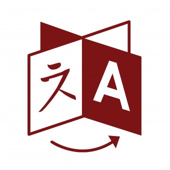
Mixed characters
Another approach to graphically representing translation is mixing characters: probably the most ubiquitous being Google Translate’s logo, which places the Chinese character ‘文’ (which can mean script, page or character depending on context) next to the latin ‘A’. This approach definitely relates to the reading element of translated content far stronger than speech bubbles do. It also works well through contrast: Chinese and latin characters are so different it’s hard for this design to have many other meanings apart from one related to language.
![]()
Google Translate is also a truly multiplatform product: the same Chinese/latin icon appears across not only the web but also mobile and tablet apps.
Microsoft’s approach to translation icon design reflects Google’s: the only difference being a choice of the Japanese letter ‘あ’, which is the first character in Japanese alphabetical ordering.
![]()
Much like Google, this icon is seen across many platforms: from Outlook through to Bing Translate.
Design-wise, the mixed character approach is very strong: it is simple and uses contrasting icons within itself to evoke a higher meaning. Coupled with the clout that Google and Microsoft products have, is this the strongest convention we have for symbolising translation?
While these icons pertain specifically to providing a translation service, pre-translated content can certainly leverage the fundamental concept of these icons.
Is the mixed script the best icon available – or are there other approaches that are more powerful and appropriate?
The ISO standards for representing language codes, variously: two-letter ones like en or ja, ones expressing regional variation like en-US, three-letter ones like tlh…are somewhat iconic.
Why not use the long-existing design tool of the decorative monogram to incorporate them into online communications?
The only downside I can see is that the codes in the first mentioned category might be confused with the two-letter UN/ISO country codes which have become widely-known through their use in ccTLDs.
When referring to _es_pañol one does not want to be mistaken as referring to _es_paña and vice versa, and even where one does not mind conflation (perhaps if the predominant language usage region and the nation are the same?) one has to be sure not to mix up ja and jp, for instance.
Using the three-letter language code ameliorates this.
And to signify that content translations are available, it is reduced by equivalency to the generally-considered-solved design challenge of signifying that options are available: the drop-down arrow. Put it with the currently-used language monogram in the appropriate place, and when users click on either they are presented with a menu of the language monograms with a full-name tooltip, or the monograms, full names, and sample text if modal.
I don’t think the turnstyle and mixed-characters icons (same idea) are as good idea as it looks like… Why should we use a chinese and a latin characters and not arabic, hebrew, cyrillic, japanese, or any of the other hundreds of scripts of the world? I think this raises the same issue like with flags in the end. It might hurt some sensitivity, or also not be very easily understood, for, say, people who don’t know what looks like a chinese or a latin character (yes, difficult to believe, but, I might exist… like some people might not recognize their language in another country flag).
If we are to find the best icon, then we should do pure iconography and not use any script character…
Punctuation might be acceptable though, as they are symbols largely shared.
So far, I think there is no perfect icon yet, but the one I prefer among the existing icons is the bubble with the 3-dots
(actually even punctuation might be problematic, as still not universal)
Hi Cédric, just found this blog and found the discussion very interesting. I am not an expert in iconography, but I don’t think that being “universally recognizable” should be a criteria here (even the ubiquitous globe could offend a flat-earther!). Being recognized by the majority is usually enough when choosing icons. By the way, I can imagine millions of people for which a bubble with 3-dots might have no meaning associated with language. From all options discussed, I still think that the turnstile/mixed-character might be the stronger. Nowadays it is actually common to see the mixed-characters inside bubbles. Why English and Chinese for the characters? Well, according to Ethnologue 2022, these are the top two most spoken languages in the world with some good distance for the third place. If you consider other languages that use Greco-Roman and Kanji based alphabets, we’ll get to the conclusion that it is very difficult for someone not to recognize them, or at least, not recognize them as characters.
Hi James, thanks for sharing your thoughts on this quite important and sometimes neglected issue. I am a PhD student on UX/HCI dealing with multilingual design, so your blog is a great source of information and interesting considerations. I think the mixed-character approach is strong and is getting more popular these days with its adoption by big players such as Microsoft and Google as you noted. More recently, I have seen the characters being displayed inside of bubbles and even combined with the globe, so that could be possible improvements.