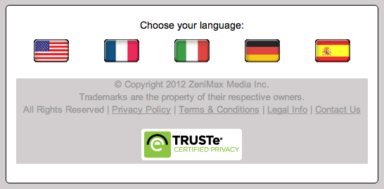
It’s hard not to look at the Bethesda Blog ‘gateway’ page and ask whether they’re asking for your location or language.
Many sites that use flags to represent languages rely on the subtle implication that a flag will assist users in choosing their language. But the fact that this page is solely dedicated to language selection and only presents users with flags explicitly suggests the site is only accessible by users from the USA, France, Italy, Germany and Spain.
The flags are also large and bold in their size: there’s no excuse here that as icons they take less space.
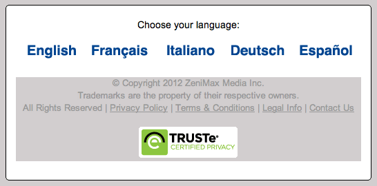
Would simply listing the language names not be far simpler and more effective?
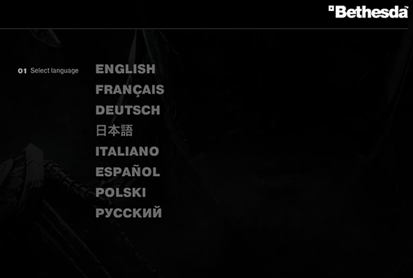
After all, on Bethesda’s main site, they’re doing exactly that:


Author of this blog just opened my eyes. I was looking for flag language(sic!) switcher for my website, that’s how i landed here 🙂
Thanks a lot. Now I will not insult someone in internet cause i will use only words not flag icons. Cheers.