ISO language codes and country codes don't mix

In 2012 I wrote about Deezer mixing up ISO country codes and languages codes — specifically Montserrat for Melayu and as a result using the flag of a small English-speaking Caribbean island for the Malay language. (Deezer has since replaced their flags and languages with a simple list of languages presented in their native name).

I recently spotted a similar set of mix ups on a plug in for accessibility and translation from Recite me used on sites such as London’s Gatwick Airport.
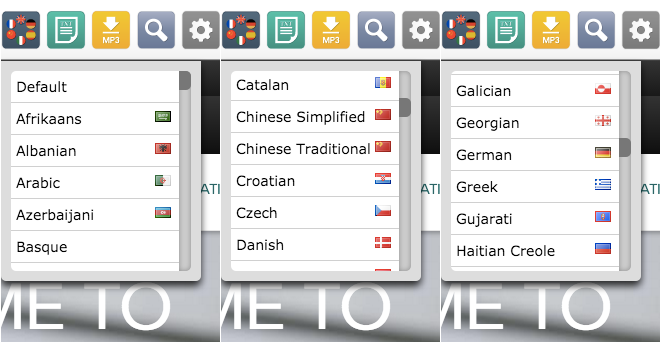
recite-me

There are some curious flag choices made for representing languages: such as Andorra for Catalan. With a population of around 80,000, there are are fewer people in Andorra than the seating capacity of Catalonia’s largest football ground, FC Barcelona’s Nou Camp (almost 100,000 people).

Traditional Chinese is represented with China’s flag while it is far more commonly used in Taiwan (where Simplified Chinese is rarely used).

The Indian flag is also used three times — for Hindi, Tamil and Telugu. However, Gujarati does not have an Indian flag: instead it has the flag of Guam. Galician also has the Greenland flag.

This is where checking your country codes and languages codes is very important: the two-letter ISO language codes for Galician (GL) and Gujarati (GU) are the same as the two-letter ISO country codes for Greenland (GL) and Guam (GU) respectively.

However, by far the strangest combination of flags and languages here is the first one: Afrikaans is shown with a Saudi Arabian flag. Another mix up possible with the “SA” abbreviation of South Africa (where Afrikaans is spoken) and Saudi Arabia?

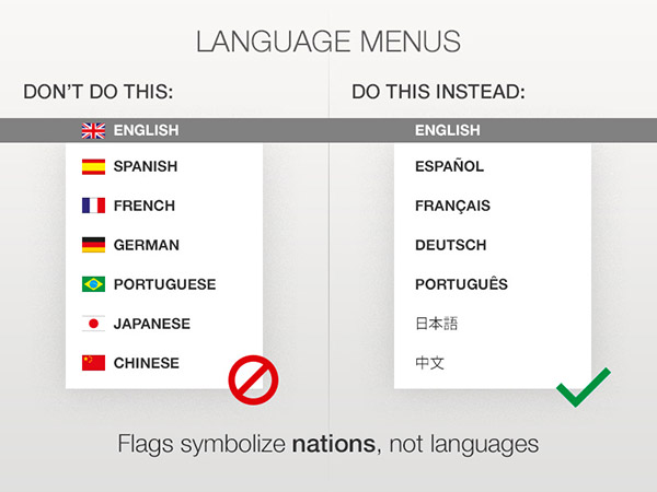
Confusing language and country codes is one pitfall of using flags to represent languages: another is the added onus of having to ensure you’re actually using the “right” flag (and determining the “right” flag is also full of pitfalls).

Had this language selector used a simpler approach with just language names presented in their native name and script then mixing up and even confusing flags wouldn’t even be an issue.
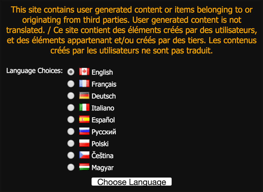
Bioware's Canadian English

Computer game companies seem to be repeat offenders when it comes to using flags to represent languages: Bethesda and Steam have both been featured on this blog (but to their credit have since removed their use of flags for language selection).

However Canadian-based game maker Bioware has really set the bar high with this almost comical use of flags for languages:

Bi

Perhaps unsurprisingly Bioware are based in Edmonton, Alberta and not French-speaking Québec.

memegenerator.net and overcomplicating language input

memegenerator.net really does what it says on the box: lets users generate memes with a variety of templates.

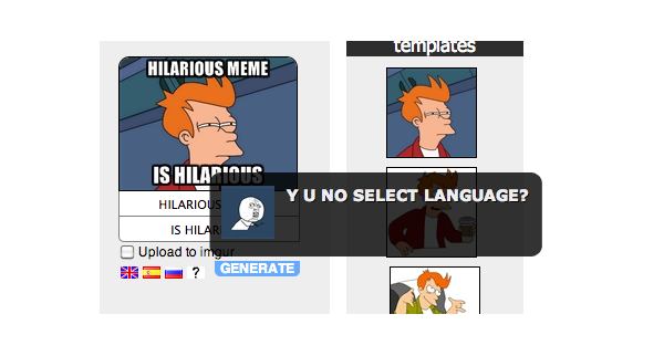
But it has a really annoying feature: you must select a language (English, Russian, Spanish or other) first. If you don’t select a language, an alert pops up with a meme demanding “Y U NO SELECT LANGUAGE?” — see what they did there? Meta-meme!

memegenerator.net

This sort of validation is incredibly annoying. And for what point? Does this have to do with special characters? Considering you can paste Spanish and Russian text and select “English” and still get a correctly rendered image, it appears not:

memegenerator.net
The only reason I can think of for this is to save the meme and present it on different language sections of the website. That’s solely for the benefit of the site and not for the user. So it still remains an awful user experience (and not to mention the use of flags for languages).

A far better experience would be simply defaulting the meme language to whatever language the site is currently being viewed in and allow users to switch between English, Russian and Spanish. If a Russian user arrives on the site in English, wouldn’t they prefer the Russian language version? There’s even a language switcher at the bottom.

It’s a great example of a bad way to overcomplicate language selection.

Duolingo: flags promoting languages

The Duolingo homepage shows six flags on its homepage to demonstrate what language services it offers. While the United States flag is used for English, perhaps more unusual is the Brazilian flag being used for Portuguese. Yes, there are more Portuguese speakers in Brazil than Portugal, but for anyone with a knowledge of flags this would appear quite strange.

However, considering Duolingo teaches US English and Brazilian Portuguese, this perhaps isn’t so strange. But yet again we hit a problem when looking at Spanish: Duolingo teaches Latin American Spanish, not traditional (Castilian) Spanish as spoken in Spain. The flag metaphor definitely breaks here.

Going back to the juxtaposition of flags and languages on the homepage: does this actually detract from Duolingo’s main message? The language names are in light grey text which is not overly visible in the first place. Look at the page again with the language names removed:

The message now suggests quite strongly that Duolingo is only available in Spain, USA, France, Germany, Brazil and Italy.

If the flags were removed, could Duolingo’s services actually be clearer and better sold to a user?

Learning is an active and verbal exercise: the text and labelling here should reflect that. And that’s another area flags fail in: they don’t reflect that active or verbal element.

This might not be as colourful without the flags, but considering Duolingo’s lovely artwork and owl character, I’m sure both could be reconciled to create a far stronger and clearer homepage without flags representing languages.

Smartisan OS and a better way to deal with language selection on devices

Smartisan is a new Android-based mobile operating system designed in China. The launch was in Chinese, however Engadget gave an in-depth summary of the launch in English.

One feature relates directly to language selection. From the Endgadget overview:

Country flags instead of text menu for language setting, so that you can easily reverse the damage if someone accidentally changes the language

In the launch, founder Luo Yonghao shows a scenario where the phone has had its language changed — and shows how the new operating system will help redress a situation like this. It’s in Chinese, but the video is easy enough to follow: and a caveat here, I don’t speak Chinese, so this blog post is based purely on the visuals shown by Luo Yonghao. The video starts by showing the difficulties users would have on various phone operating systems (Android, Windows Mobile and iOS) if they have to change the phone language back but can’t understand any labels:

It ends with rapturous applause as Luo Yonghao show’s Smartisan’s solution to this problem: a bar with flags to denote language settings.

Having a phone with a different language can indeed be extremely frustrating: I myself recently borrowed a Palm Pre from a German friend and had a lot of fun trying to find how to change the language to English. It’s a definite problem: although in practice I think in most scenarios where a phone’s language is changed into an unintelligible language it’s usually the result of a prank rather than a user mistake. (And it’s quite a good prank for precisely this reason: it’s a real pain to undo.)

While the flag icons definitely help, I don’t think they’re ideal here because they could also suggest regional or location settings: timezone, date format or currency. I think some of the approaches highlighted elsewhere on this site would work far better.

But stepping away from icons, Smartisan could actually do far better to deal with this sort of scenario — and in fact, all software designers could.

Let’s reconsider the scenario we’re dealing with here: a user who speaks language X is trying to change the language of the phone which is in language Z.

Going back to the Smartisan example, the flag icons are at the very bottom of the settings screen. A user has to scroll to the very bottom to find them.

Consider the following ideas for dealing with this problem:

  1. Arguably the language settings on a phone should be at the very top of the settings screen: in the Android example shown first, it’s actually the third in the list.
  2. If the language settings are not at the top of the settings screen, then after changing the phone’s language move the language settings to the top
  3. Make the operating system remember the previous language setting and label the language selection in the previous language in addition to the current language.

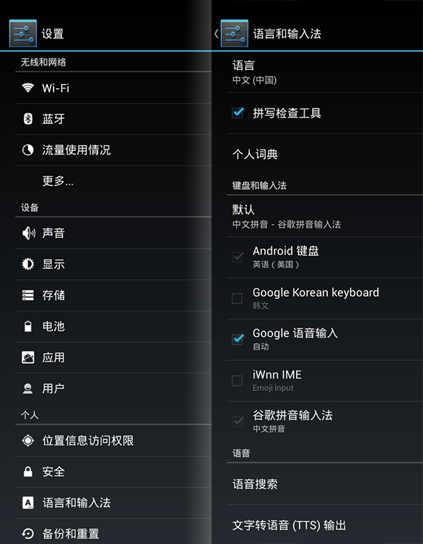
For example, the current Android OS after changing the language from English to Chinese. On the left is the main system menu, and on the right the language sub menu:

You’re in for some serious guess work here if you don’t read Chinese and want to change the language.

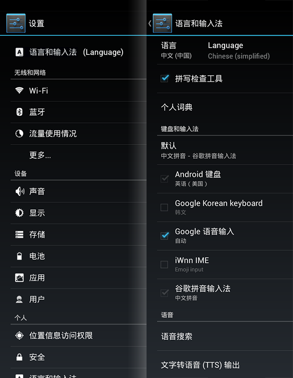
Now using some of the above suggestions, a responsive way of dealing with accidental language changing — the labels are in English here but should be whatever the previous language was:

Would this be annoying for users who change their language on their devices? Probably not too annoying — and how many users do this anyway? Would it be useful for those who accidentally changed their language — or have been the victim of a prank? Immensely.

Flags aside, this is a much better way of dealing with language selection on all devices.

Barclays Cycle Hire language selection

Officially known as Barclays Cycle Hire, Transport for London’s blue hire bikes are a ubiquitous sight around London. Hiring a bike is fairly straightforward using the interactive kiosks located next to docking stations around the city.

The kiosks support seventeen languages: along with English, the system is localised in German, Spanish, French, Italian, Arabic, Bengali, Gujarati, Hindi, Chinese, Polish, Punjabi, Tamil, Turkish, Urdu, Vietnamese and Japanese.

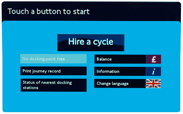
The icon for language selection is a British flag:

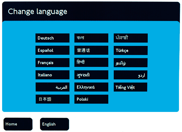
However, this is the only flag used for language, as shown on the language selection screen below:

The use of the British flag is an interesting choice. While the system doesn’t explicitly use flags to represent languages, it does use a flag to show availability of languages.

It would be very interesting to see stats on how many users actually find and use localised versions of the kiosk. By using the British flag alone, could the system possibly miscommunicate itself?

London’s official promotional organisation London & Partners provides visitor statistics to London by nationality. The top three nations are the USA, France and Italy. This allows us to begin to understand the types of users who would be using the system.

Currency?

Looking at the top three types of visitors, could users mistake the British flag for a currency icon rather than a language icon? Payment is only available in the Great British Pound — visitors from the US may want to use US dollars or visitors from the EU may want to use the euro. (This may be either cancelled out or confused even further by the pound icon next to ‘balance’ on the home screen in the top right.)

Probably not a major issue — but it does suggest the language selection proposition represented by the British flag is not as strong as it could be.

Exclusivity?

As a visitor or new immigrant, does the British flag suggest it could be exclusively for British citizens only? By virtue of the flag being isolated here, again this is a possibility. Ironically the presence of other flags would probably negate this.

Improvement through prioritisation

Obviously the majority of visitors from United States would not need translated content. Many French, German and Italian users may have a good enough grasp of English to navigate the system without translation — so users from those countries might not use the translations as much as users from perhaps Asia or South America.

The most effective strategy for presenting translation options would be to find the balance between the group of language speakers that would benefit most from translation versus the group of language speakers that comprise the largest number of users.

Once establishing this, language selection can be based on this priority.

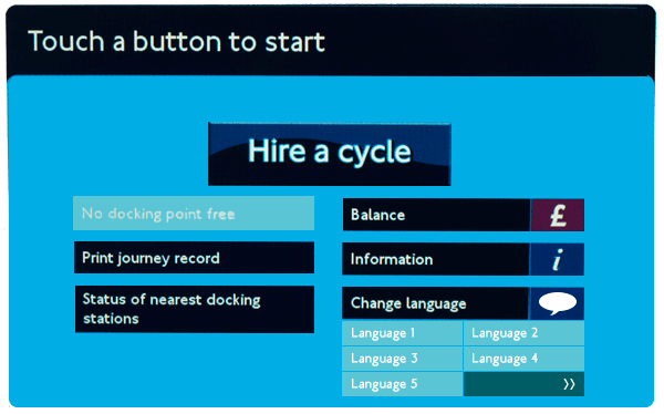
The new design above shows a more generic speech bubble icon instead of a flag to represent language. It also displays five languages on the home screen and a button alluding to further languages being available.

Would the above screen work better at showing language options? Potentially — of course the only true way to know would be to test this with real users.