Key lessons learned (the TL;DR version):
- users are easily able to find translation links in footers
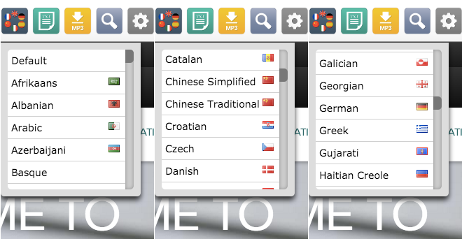
- language names work well at communicating links to translations – but only if the user is familiar with that alphabet (for instance, as English-speaking user won’t recognize Chinese lettering if Chinese is the current language)
- the use of flags do not aid users more than listing language names and using other iconography for selectors
- be careful when using online remote testing. Careless participants can skew your outcomes
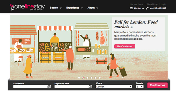
onefinestay is a holiday/vacation rental service with a difference: it aims to give you the chance to stay in someone’s place while they’re out of town and “live their life”. They consider themselves an unhotel.
Currently they operate in four cities: New York, Los Angeles, London and Paris. While most of their users are US-based, they receive significant traffic from users who speak French, Spanish and Portuguese.
While their site is currently only available in English they are looking at providing localised versions. This is especially important considering their service in Paris which is only available through an English interface. Working with their Product Manager Matt Isherwood (a former colleague of mine), we started to discuss what the best way to present multiple languages on the site would be. User testing these approaches was the obvious way forward.
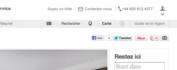
The first design aimed to integrate language selection as a sub-option within a user management dropdown represented by a user icon (see below for screenshot). This would also contain other site settings such as currency and other account information.
Using UsabilityHub for super-fast remote testing some interesting outcomes and insights were discovered.
The test? Prior to seeing a screen, users were given the following instructions:
While looking for a place to stay in Paris you find this page. Where would you click to view a version in English?
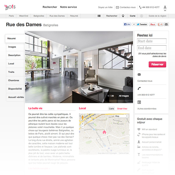
Test users would then see a full-screen mock up of a onefinestay page translated into French in which hopefully they would be able to find a way to navigate to the English-language version of the site.

Partial screenshot of test screen
Iteration one: user icon
Would users associate changing language with this icon? I was concerned the task of changing language was too far removed from the sort of user settings this icon usually represents. In a more application-focused product it might (think Twitter or Facebook: language settings are found in user menus). But on a website which doesn’t require logging in why should a user need to access anything under a user management menu – unless, of course, they are logged in?
The first ten tests confirmed this concern. Only one user out of 10 interacted with the icon. However, the remaining 90% (nine users) scrolled to the bottom and found the supplementary language links there.
First lesson: users appear to have no problem finding translation links in footers.
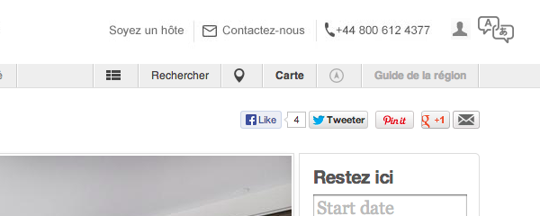
Iteration two: nounproject translation icon
Translation icons come in several varieties but the unofficial convention on these icons tie together an eastern character (often Chinese or Japanese) with a Latin equivalent (usually the letter ‘a’). One such variation found on the nounproject icon library site combines with convention with speech bubbles to create a fairly strong icon for translation.
Would this perform better? I expected it too but wondered if the context of the action wasn’t quite right. This icon feels more suited to the action of translation (think Google Translate or a language dictionary) rather than selection of a site-wide language.
Whether it was context or another factor – and this is where quantitative testing can still leave us in the dark – the icon still failed. It performed better than the icon but only 30% of users interacted with this element (four in total).
However, yet again the remaining 70% users (six total) still found the supplementary links at the bottom of the page. Our first lesson had been reinforced but the menu was still struggling.
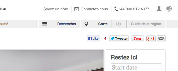
Iteration three: globe icon
The globe icon can, unfortunately, be extremely vague. On Facebook – which arguably shapes the visual meaning of this icon immensely — it functions as a notifications icon (although as John Yunker points out, it’s probably one of the best choices for a translation/localisation icon).
Would be global/international meaning work well with the context of this task? It worked better, but still not great: 50% (five users) interacted with it to change the language (and yes, yet again the remaining 50% of users found the language links at the bottom of the page).
While 50% is an improvement, it’s still not satisfactory.
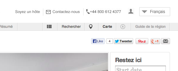
Iteration four: language names
By this point I was concerned the premise of the dropdown was also being lost. So I integrated a downward triangle to better communicate the presence of hidden options below the icons.
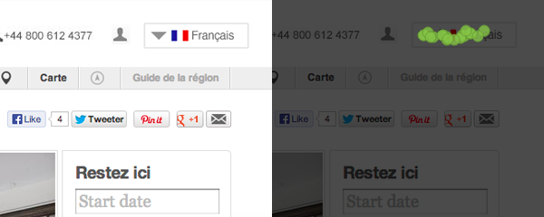
By adding a text label for the current language in French (and in French – Français) would this be obvious to users?

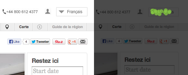
Click map showing user clicks from user testing.
The results were promising. To be better sure of these results statistically, I bumped the test numbers up to 20. The success percentage still remained excellent at 95% (19 users). And the one user who didn’t interact with the menu? They also found the English link at the bottom.
This appeared to be a winning option.
Second lesson: perhaps unsurprisingly, language links work very well as language links.
While both the onefinestay design team and I were against using flags for language selection, this seemed an interesting opportunity to test whether flags do indeed signpost language selection any better.
After adding a French flag to the drop down, I repeated the test on an another twenty users. The result? Identical. 95% found the menu link and the other single user still found the footer link.
Third lesson: flags don’t appear to add any extra advantages to this approach.
So we appear to have found a winning formula? Not quite.
What if onefinestay adds a Chinese option to their menu and we change the task slightly: you’re in Shanghai trying to find a place to stay. By following the same approach, this is what a user would see:
(This is not dissimilar a problem recently faced by Anna Kay on the Mozilla site. On her blog she describes being unable to find a language chooser due to all the text on the site being in Chinese).
Based on what I’d seen on the Mozilla site — and Anna’s own testing — there was not much point testing this.
So time for two more tests: one using icons and the other using a flag – just to test our two best performing variants. The globe icon so far had performed the best so I used this along with making the language label blue to give it some more visual prominence – the flag variant already had this thanks to the red of the Chinese flag.
The test script obviously needed to change for this, so the following scene was set for test users:
While looking for a place to stay in Shanghai you find this page. Where would you click to view a version in English?

Click map for the globe icon dropdown

Click map for the flag dropdown. The red dot shows a user hitting outside the hit area trying to find a link to English content
The results from these tests were far less black and white. A small percentage of users (5-10%) could not find the links at the bottom or the dropdown at the top in either test variation. The lack of Latin characters seemed to add an extra layer of confusion on the task.
With the success/failure rate between both test variants ebbed and flowed. At 20 tests each, the flag variant performed better by only two successful user tests — but success rates for both were below 60%. Was this statistically proof enough to show the flag variant being more successful? Not really. In fact statistically both designs looked flawed with such a low success rate (caveat: even if the flag was performing better, I’d still be very weary using flags in this situation for numerous reasons).
However raising the test number to 30 gave a more positive outcome for both: yet again both hit a 66.6% success rate. Only one user on the globe variation failed to find the dropdown or footer links, whereas two users failed both on the flag variation — the remainder found the translation links in the footer.
Again, our third lesson was reinforced: flags don’t offer any much more assistance to users.
With users finding language links in the footer, I wondered whether a dropdown was even necessary. So in the final test I tried a variation of the Chinese page with only links to translated content in the footer.
 Click map showing users expecting to find language selector in the top right area
Only 50% out of ten users tested found the footer links in this test: and the clicks shown above strongly suggest that users expect to see some sort of language switcher in the header.
There was a fourth lesson I learnt from this form of testing: one or two careless users can radically skew these results. Along with blowing averages out with poor response time (always be wary with averages: any decision based on an average should only be taken after analysing the full data range) an errant click can easily cast doubt on certain designs.
Unlike a face-to-face test, you can’t guide a user either: if they don’t understand the question then your hypothesis can suffer from whatever action they then take. Distinguishing genuine failures from clicks from test users who don’t care and just want to get through the test can be very tricky. But these outliers can skew your results and should be discounted where possible (and replaced with supplemental tests).
So in conclusion, if you’re planning on implementing a dropdown language switcher, consider the following:
