What if a user visiting an e-commerce site wants to change the language of the site? Or the currency? Thinking about currency, the main reason a user would change currency is because they’re viewing the site from another country. So often currency and country selection are very closely tied. Language, however, can be less straightforward. Countries like Belgium, Canada, Singapore and Switzerland may have multiple languages but only one currency.
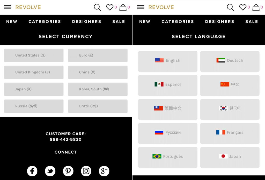
Revolve approach the scenario of languages and currency in a rather cumbersome way: they have a separate currency selector and language selector.
First and foremost, and this is why this example has been used in this particular post, Revolve has bizarrely ended up with the flag of the United Arab Emirates for German. Probably a simple mistake but another reason why using flags to signify languages can lead to embarrassing mistakes like this one. The other choices of flags in this menu imply country selection over language: for example the Brazilian flag for Portuguese and Mexican flag for Spanish.
How many users are likely to browse the site in Chinese and want to see prices in Russian Rubles? Probably very unlikely. How many users browsing the site from Mexico want to view the site in Spanish but see prices in Mexican pesos? Probably a lot more, but while the Mexican flag is used for Spanish, Mexican pesos is not an available currency.
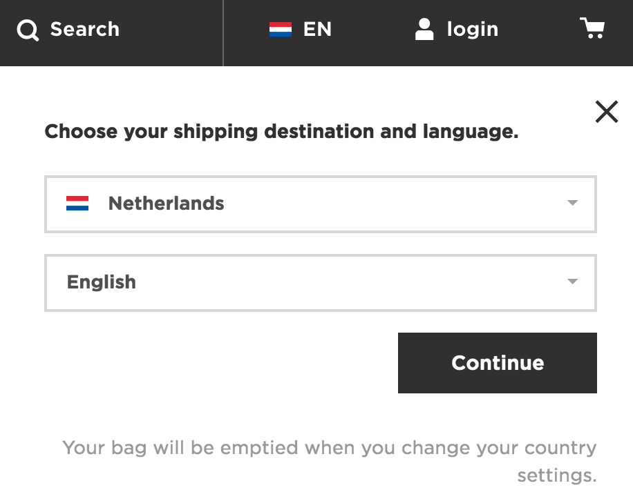
Thinking about the scenario of changing currency it would be most closely linked to the country of the user. And the country of the user would of course also relate to language. This is where the G-Star Raw site provides a far simpler UX solution that uses flags correctly.
It asks the user to specify their shipping destination and their language from a single dropdown option:
This is a far simpler approach that also uses flags appropriately.
Even if Revolve didn’t want to focus on shipping destination and just give a user the ability to view different currencies and languages, they could do so very easily by following the same approach as G-Star Raw and avoid these issues with flags.


Nowadays (Dec/’22) it is very common to see separate selectors for language and currency. Many accommodation and airline websites do just that (see Booking.com, Hostelworld.com, and Skyscanner.com). I can imagine many situations in which this arrangement could be very useful for international/multilingual users. I don’t know about the situation in 2016, but currently I would not call this solution cumbersome. Regarding the flags, I totally agree: I believe they were the real problem with this design.