From Damian Vila on Dribbble:
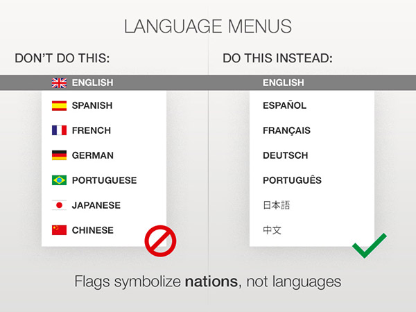
Dribbble has several shots of language selectors using flags — however this one raises awareness of the simple fact that flags symbolize nations and not languages.
A blog about designing global user experiences: beyond language, location & culture.
From Damian Vila on Dribbble:
Dribbble has several shots of language selectors using flags — however this one raises awareness of the simple fact that flags symbolize nations and not languages.
Officially known as Barclays Cycle Hire, Transport for London’s blue hire bikes are a ubiquitous sight around London. Hiring a bike is fairly straightforward using the interactive kiosks located next to docking stations around the city.
The kiosks support seventeen languages: along with English, the system is localised in German, Spanish, French, Italian, Arabic, Bengali, Gujarati, Hindi, Chinese, Polish, Punjabi, Tamil, Turkish, Urdu, Vietnamese and Japanese.
The icon for language selection is a British flag:

However, this is the only flag used for language, as shown on the language selection screen below:

The use of the British flag is an interesting choice. While the system doesn’t explicitly use flags to represent languages, it does use a flag to show availability of languages.
It would be very interesting to see stats on how many users actually find and use localised versions of the kiosk. By using the British flag alone, could the system possibly miscommunicate itself?
London’s official promotional organisation London & Partners provides visitor statistics to London by nationality. The top three nations are the USA, France and Italy. This allows us to begin to understand the types of users who would be using the system.
Looking at the top three types of visitors, could users mistake the British flag for a currency icon rather than a language icon? Payment is only available in the Great British Pound — visitors from the US may want to use US dollars or visitors from the EU may want to use the euro. (This may be either cancelled out or confused even further by the pound icon next to ‘balance’ on the home screen in the top right.)
Probably not a major issue — but it does suggest the language selection proposition represented by the British flag is not as strong as it could be.
As a visitor or new immigrant, does the British flag suggest it could be exclusively for British citizens only? By virtue of the flag being isolated here, again this is a possibility. Ironically the presence of other flags would probably negate this.
Obviously the majority of visitors from United States would not need translated content. Many French, German and Italian users may have a good enough grasp of English to navigate the system without translation — so users from those countries might not use the translations as much as users from perhaps Asia or South America.
The most effective strategy for presenting translation options would be to find the balance between the group of language speakers that would benefit most from translation versus the group of language speakers that comprise the largest number of users.
Once establishing this, language selection can be based on this priority.

The new design above shows a more generic speech bubble icon instead of a flag to represent language. It also displays five languages on the home screen and a button alluding to further languages being available.
Would the above screen work better at showing language options? Potentially — of course the only true way to know would be to test this with real users.
Bab.la is an excellent online language resource with online translation as one of its core services — in an impressive 22 languages.
The site makes heavy use of flags as iconography, with some interesting flag choices: Arabic is represented by the Egyptian flag, Swahili by the Kenyan flag and Hindi by the Indian flag.

Arabic is an official language in 24 countries other than Egypt (however, Egypt is by far the largest by population) and Swahili is an official language in four countries. While Hindi is the most widely spoken language in India, there are 22 official languages in India.
Furthermore, English is represented by the Union Jack; however it is an official language in over 50 countries. Also, the United States which has many more English-speakers than the United Kingdom. (The same argument can be applied to the use of Spanish and Portuguese flags for those languages in relation to Mexico and Brazil respectively).
Regardless of whether flags are appropriate in this situation, another question can be posed: do the flags actually aid in legibility of the translation menu? Or are they actually distracting?
Consider the Google Translate interface that supports 65 languages:
Arguably the Google Translate is easier to read and far more compact on screen: and it achieves this in part by not using flags to represent languages.
It’s hard not to look at the Bethesda Blog ‘gateway’ page and ask whether they’re asking for your location or language.

Language or location?
Many sites that use flags to represent languages rely on the subtle implication that a flag will assist users in choosing their language. But the fact that this page is solely dedicated to language selection and only presents users with flags explicitly suggests the site is only accessible by users from the USA, France, Italy, Germany and Spain.
The flags are also large and bold in their size: there’s no excuse here that as icons they take less space.
Would simply listing the language names not be far simpler and more effective?

After all, on Bethesda’s main site, they’re doing exactly that:

The LEGO website is available in 17 languages. When a user goes to select language, they are prompted to first choose their country or region and then their language as appropriate.

Belgian users have the option of French or Dutch content specific to their country; Spanish users can select Spain or Latin America as appropriate.
The use of flags here gives priority to country/region first — which is why it works. Only for Latin America is a flag not used, as it is obviously referring to a whole region and not a specific country. Language is a secondary option. In this scenario, LEGO’s use of flags works very well.
As a global brand, LEGO has registered domains in many other countries even though they do not have local content for all of them. The site does its best to redirect users to the most appropriate version of the site. Australia users visiting www.lego.com.au are redirected to the UK English site; Canadian users visiting www.lego.ca are redirected to the US English site.
As the site gives priority to country over language, this is a much better approach than just combining flags with language names.
However, there are limitations to this approach: Swiss users accessing www.lego.ch are redirected to the German site. French-speaking Swiss users may not appreciate this, but given there is no specific Swiss content available this is far more acceptable than just redirecting them to a generic German-language site. Ideally, however, the LEGO site would do better checking the language of the user and redirecting them based on that — not just the domain they’re visiting.
While it’s not perfect, the thought that LEGO has put into its user experience for international users is highly commendable.
The Steam client is a great video-gaming platform. It allows users to buy and download games, connect with friends and share screenshots from their gaming experiences. The website is available in 24 languages, and it even has a community-driven translation project.
However, unlike the website, the Windows client has some issues with language versus location.

Steal install screenshot
The choice of Chinese Simplified versus Chinese Traditional is interesting: Simplified is the norm in mainland China, yet Traditional is mostly used in Taiwain (but also Chinese ethnic groups outside of mainland China).
But the other flag choices are inconsistent: the United States flag is used for English. Understandable perhaps as Steam are a US-based company, but a look at the Steam client stats server reveals Steam has heavy usage in other English-speaking countries such as Australia, Britain, Canada, Ireland, New Zealand, Singapore and South Africa.
While there is no data on Brazilian users versus Portuguese, by sheer population numbers one would expect Brazil to have more users than those in Portugal: yet the Portuguese flag is used for Portuguese. Again, this is inconsistent with the choice of the US flag for English.
As for Spanish, how many users are in Spain compared to Argentina, Chile and Mexico or other Spanish-speaking countries?
Are Steam really asking what country the user is in, or what language they prefer? It appears to be a confused mix between the two.
Another problem with this install process is the lack of localised names — forcing users into selecting a flag to for their language (whilst the language is labelled in the English-name for that language).
The Steam website handles translations brilliantly: each language is localised and also in English for disambiguation. And no flags.
However, their installer client needs some more thought.
The Tate Galleries in the UK are a word-class collection of galleries and have a great website — with the exception of the language links on the homepage.

The most interesting part of this design choice is that there is obviously a cultural awareness that flags may not properly represent the Arabic and Chinese languages — so these languages are just written in their local equivalents.
But not so for French, German, Italian, Portuguese, Spanish, Japanese, Greek, Russian or Polish.
Furthermore, the flags are repeated in the content area of the pages these links lead to: of course with the exception of Arabic and Chinese.
(It’s also worth noting the BSL — British Sign Language — link. The hand icon here seems very appropriate for this).
Another issue with the choice of flags for some languages and the language name for others is also simple consistency.
Wouldn’t this design work far better if it just showed the language names?

Simple, consistent and uncontroversial?
Social activism site avaaz.org is beautifully designed: both visually and experience-wise.

The site is available in 14 languages: each easily accessible from the top banner and presented in their local formats. Furthermore, the site autodetects the users language and redirects them to a localised version (if one is available).
A simple yet very effective way of presenting multilingual content.
The Metropolitan Police website provides language content in 16 languages other than English: Arabic, Bengali, Chinese, French, Greek, Gujarati, Hindi, Japanese, Polish, Portuguese, Punjabi, Somali, Spanish, Turkish, Urdu and Vietnamese. That’s quite a diverse range of content.

From the homepage, a neat and attractive row of 12 flags links through to a landing page listing 16 languages.
12 flags, 16 languages: are some flags missing from the homepage?
Let’s follow the link and go to the next page:

Starting with the positive, each language is displayed in its native name and script (and also repeated in English).
But other than that, this is all wrong. It’s probably the single best example of why using flags for languages is so fundamentally flawed.
The biggest problem on this page is the use of the Indian flag three times for Hindi, Gujarati and Punjabi. With the former, it’s worth noting that there are actually over double the amount of Punjabi speakers in Pakistan (60 million speakers) than in India (27 millon speakers).
Saudi Arabia’s flag has been chosen for Arabic on this page, yet on the homepage the flag of the Arab League has been used.
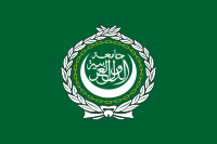
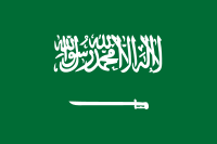
Arab League or Saudi flag — is either an appropriate representation of the Arabic language?
Consistency aside, obviously there’s been some trepidation here about how to represent the Arab language with a flag. More reason, of course, to avoid using any flag for language representation.
A final gripe: the homepage flags, for their inherent flaws, do look rather nice. However, the quality of the flags on the landing page is simply awful (not to mention the poor legibility of the native language names). Give flags some respect and please save them with an appropriate level of quality!