memegenerator.net and overcomplicating language input

memegenerator.net really does what it says on the box: lets users generate memes with a variety of templates.

But it has a really annoying feature: you must select a language (English, Russian, Spanish or other) first. If you don’t select a language, an alert pops up with a meme demanding “Y U NO SELECT LANGUAGE?” — see what they did there? Meta-meme!

memegenerator.net

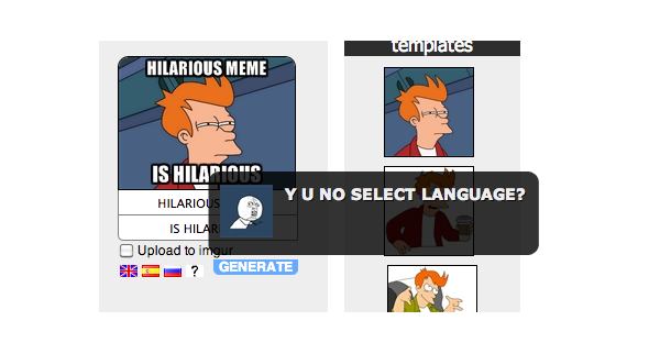
This sort of validation is incredibly annoying. And for what point? Does this have to do with special characters? Considering you can paste Spanish and Russian text and select “English” and still get a correctly rendered image, it appears not:

memegenerator.net
The only reason I can think of for this is to save the meme and present it on different language sections of the website. That’s solely for the benefit of the site and not for the user. So it still remains an awful user experience (and not to mention the use of flags for languages).

A far better experience would be simply defaulting the meme language to whatever language the site is currently being viewed in and allow users to switch between English, Russian and Spanish. If a Russian user arrives on the site in English, wouldn’t they prefer the Russian language version? There’s even a language switcher at the bottom.

It’s a great example of a bad way to overcomplicate language selection.

Bab.la: flag overload?

Bab.la is an excellent online language resource with online translation as one of its core services — in an impressive 22 languages.

The site makes heavy use of flags as iconography, with some interesting flag choices: Arabic is represented by the Egyptian flag, Swahili by the Kenyan flag and Hindi by the Indian flag.

Arabic is an official language in 24 countries other than Egypt (however, Egypt is by far the largest by population) and Swahili is an official language in four countries. While Hindi is the most widely spoken language in India, there are 22 official languages in India.

Furthermore, English is represented by the Union Jack; however it is an official language in over 50 countries. Also, the United States which has many more English-speakers than the United Kingdom. (The same argument can be applied to the use of Spanish and Portuguese flags for those languages in relation to Mexico and Brazil respectively).

Regardless of whether flags are appropriate in this situation, another question can be posed: do the flags actually aid in legibility of the translation menu? Or are they actually distracting?

Consider the Google Translate interface that supports 65 languages:

Arguably the Google Translate is easier to read and far more compact on screen: and it achieves this in part by not using flags to represent languages.

Bethesda Blog: language or location?

It’s hard not to look at the Bethesda Blog ‘gateway’ page and ask whether they’re asking for your location or language.

Language or location?

Many sites that use flags to represent languages rely on the subtle implication that a flag will assist users in choosing their language. But the fact that this page is solely dedicated to language selection and only presents users with flags explicitly suggests the site is only accessible by users from the USA, France, Italy, Germany and Spain.

The flags are also large and bold in their size: there’s no excuse here that as icons they take less space.

Would simply listing the language names not be far simpler and more effective?

After all, on Bethesda’s main site, they’re doing exactly that:

Steam: choose language or choose country?

The Steam client is a great video-gaming platform. It allows users to buy and download games, connect with friends and share screenshots from their gaming experiences. The website is available in 24 languages, and it even has a community-driven translation project.

However, unlike the website, the Windows client has some issues with language versus location.

Steam install screen

Steal install screenshot

The choice of Chinese Simplified versus Chinese Traditional is interesting: Simplified is the norm in mainland China, yet Traditional is mostly used in Taiwain (but also Chinese ethnic groups outside of mainland China).

But the other flag choices are inconsistent: the United States flag is used for English. Understandable perhaps as Steam are a US-based company, but a look at the Steam client stats server reveals Steam has heavy usage in other English-speaking countries such as Australia, Britain, Canada, Ireland, New Zealand, Singapore and South Africa.

While there is no data on Brazilian users versus Portuguese, by sheer population numbers one would expect Brazil to have more users than those in Portugal: yet the Portuguese flag is used for Portuguese. Again, this is inconsistent with the choice of the US flag for English.

As for Spanish, how many users are in Spain compared to Argentina, Chile and Mexico or other Spanish-speaking countries?

Are Steam really asking what country the user is in, or what language they prefer? It appears to be a confused mix between the two.

Another problem with this install process is the lack of localised names — forcing users into selecting a flag to for their language (whilst the language is labelled in the English-name for that language).

The Steam website handles translations brilliantly: each language is localised and also in English for disambiguation. And no flags.

However, their installer client needs some more thought.

"Romanians are smart" campaign and the problem of similar flags

The website Romanians are smart has an interesting and noble objective: change the results associated with “Romanians are…” on Google into something more positive.

If you go to Google and type “Romanians are” in and wait for the autocorrect to kick in and you’ll see for yourself how racist the current results are.

The site encourages users of different languages to click on a link that enters the term “Romanians are smart” into Google (in their language), hopefully moving the more positive search term further up Google’s list of autocorrect options.

On the homepage there are links in English, French and Romanian. These languages are also complimented by flags. Romanian has a Romanian flag and English gets the United States treatment. But as for French, it appears the site has the wrong flag.

Romanians are smart

Light blue on top, white in the middle and red on the bottom — the flag used for French is far more similar to Luxembourg’s flag than that of France’s.

France
France
Luxembourg
Luxembourg

French is spoken in both France and Luxembourg

However, the flag used could also be seen as the Dutch flag — could this flag choice confuse a Dutch user thinking they were accessing content in Dutch?

Netherlands
Netherlands
Luxembourg
Luxembourg

The Netherlands and Luxembourg share an almost
identical flag but share no common language

Obviously this is probably just a simple design oversight — the French flag is simply upside down. But it still demonstrates the problem with using flags to represent languages.

Continue reading "Romanians are smart" campaign and the problem of similar flags

Tate Art Galleries: 12 languages, 9 flags

The Tate Galleries in the UK are a word-class collection of galleries and have a great website — with the exception of the language links on the homepage.

Tate

The most interesting part of this design choice is that there is obviously a cultural awareness that flags may not properly represent the Arabic and Chinese languages — so these languages are just written in their local equivalents.

But not so for French, German, Italian, Portuguese, Spanish, Japanese, Greek, Russian or Polish.

Furthermore, the flags are repeated in the content area of the pages these links lead to: of course with the exception of Arabic and Chinese.

(It’s also worth noting the BSL — British Sign Language — link. The hand icon here seems very appropriate for this).

Another issue with the choice of flags for some languages and the language name for others is also simple consistency.

Wouldn’t this design work far better if it just showed the language names?

Simple, consistent and uncontroversial?

avaaz.org: simple yet effective multilingual content design

Social activism site avaaz.org is beautifully designed: both visually and experience-wise.

The site is available in 14 languages: each easily accessible from the top banner and presented in their local formats. Furthermore, the site autodetects the users language and redirects them to a localised version (if one is available).

A simple yet very effective way of presenting multilingual content.